Key takeaways
– The OptaPro data science team have developed methods to describe how scoring rate and controlled shot probability change for players and teams throughout an innings.
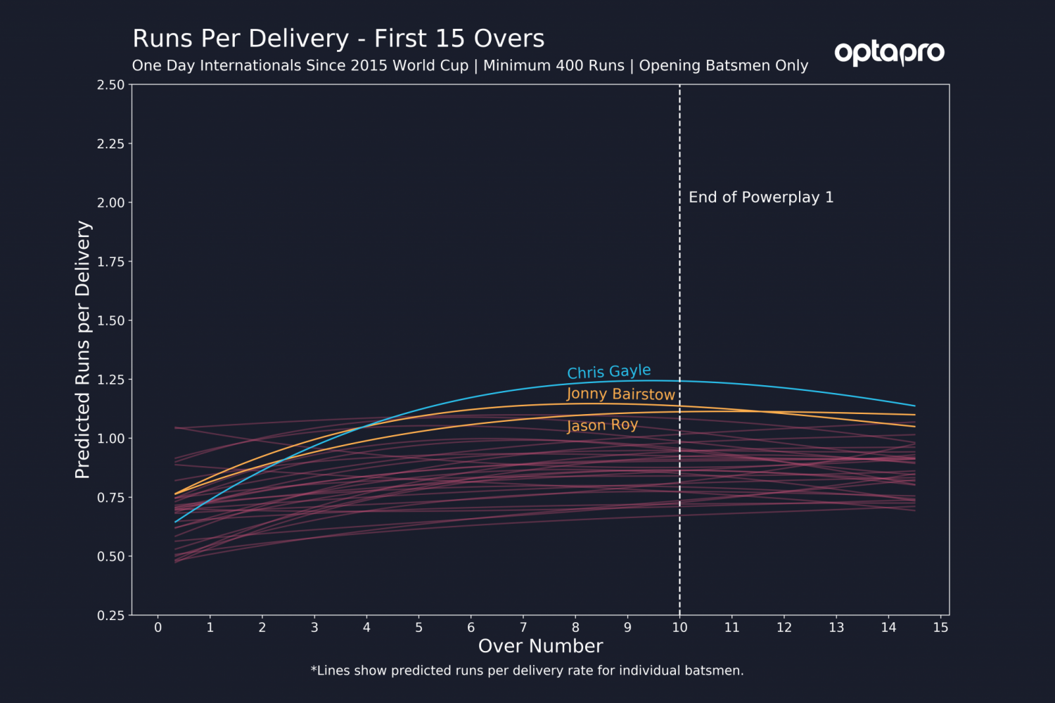
– Of World Cup opening batsmen, England’s pair of Jonny Bairstow and Jason Roy both rapidly increase their scoring rate after a couple of overs to a level exceeded by only Chris Gayle.
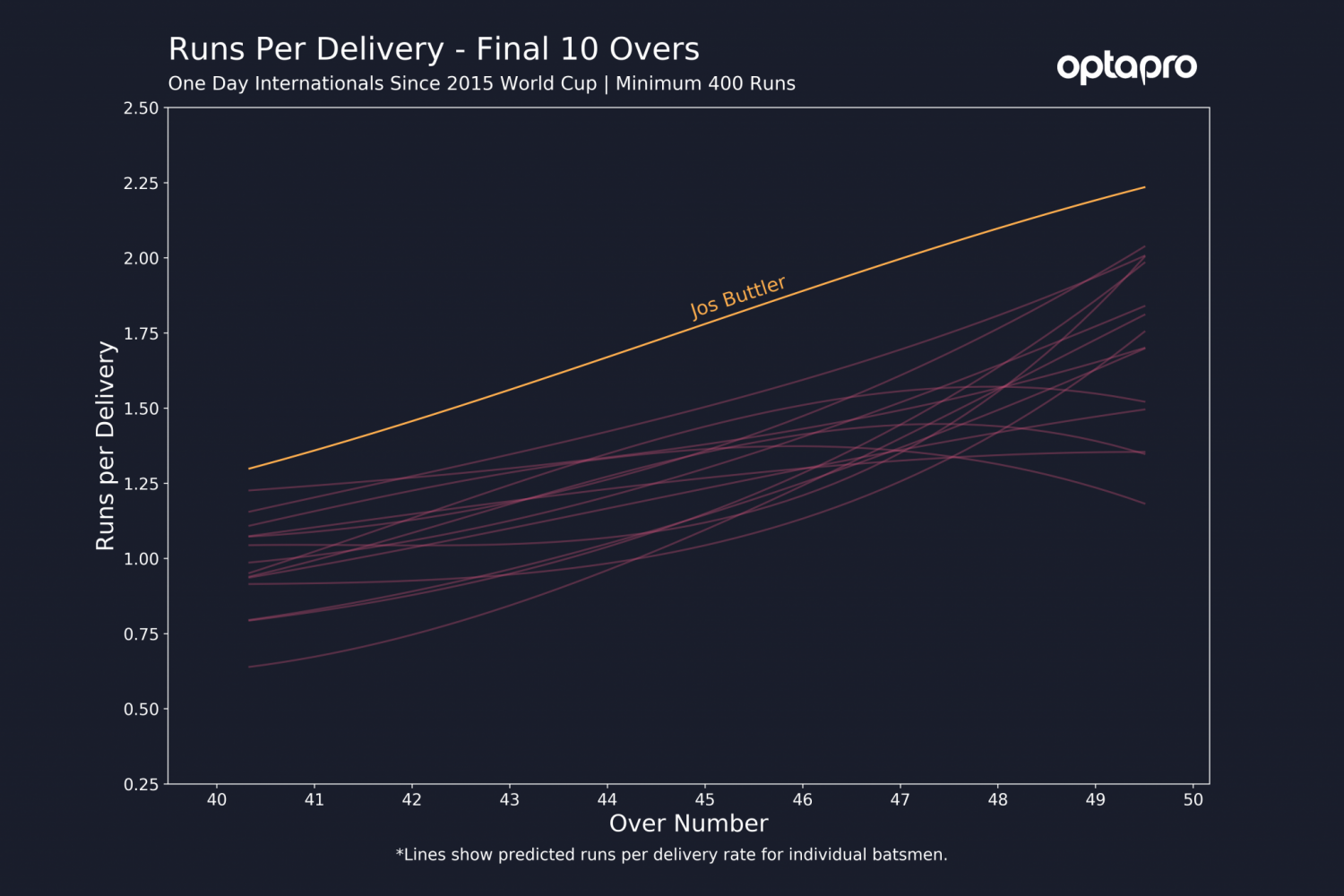
– In the final 10 overs, England’s Jos Buttler accelerates earlier than anyone else at the World Cup, with a steady but consistent increase of scoring rate throughout overs 41-50.
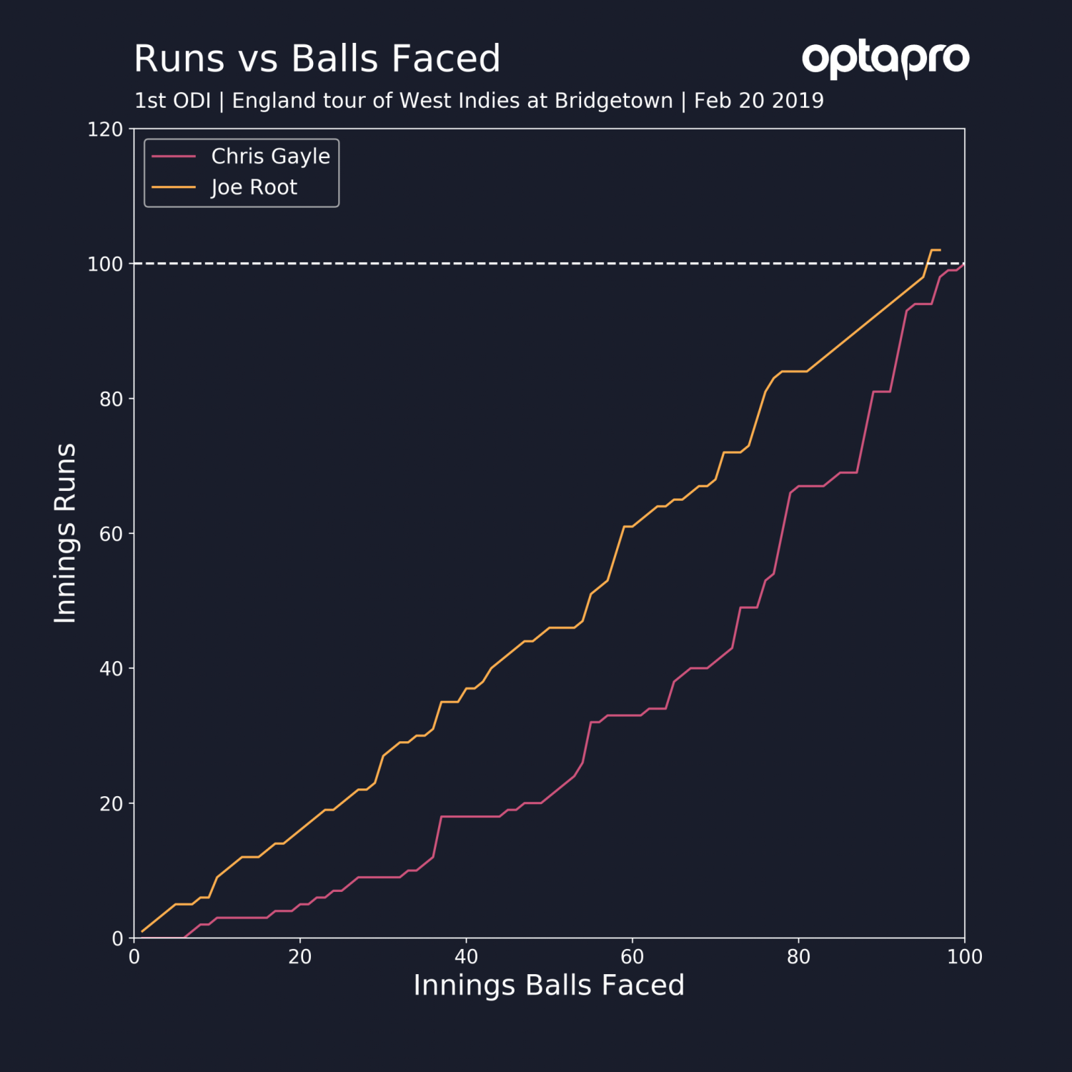
It’s February 20th 2019, the first One Day International (ODI) between West Indies and England at Bridgetown, Barbados. England have just eased to a once formidable target of 361. A glance at the scorecard shows that Joe Root has sauntered to a hundred off 96 balls and Chris Gayle has blasted himself to a hundred off 100 balls.
Their final scores are Joe Root 102 off 97 balls. Chris Gayle 135 off 129 balls.
To a casual cricket fan observing the scorecard, the verbs used to describe Root and Gayle’s innings might seem a little odd. To measure the speed of an innings on the scorecard, we typically use the innings strike rate (runs per 100 balls). In this case both have a final strike rate of 105. So why would someone who had watched the game be inclined to describe their innings differently? Let us look at the innings progression to 100 runs below to see why.

Here we get a better idea of how their innings developed. In typical fashion, Root was the glue in England’s chase and progressed to 100 at a consistent run a ball rate. However, Gayle took a different route. His first 50 runs came in 76 balls and his second 50 in just 24. Although this is quite an extreme example for Gayle, it is not uncommon for him to start slowly before switching gear and accelerating at a rate that few other players can match. However, at the end of the day’s play, the entries for each player on the scorecard look remarkably similar in terms of strike-rate.
Building an understanding of innings progression
To gain a better understanding of how a particular batsman plays we must consider measurements that evolve throughout an innings. The data science team at OptaPro have developed methods to compare and assess player performance based on how their metrics change throughout an innings.
In the case of 50 over cricket, this could be comparing how a player typically aims to build their innings in terms of their run-rate, but also through measures such as controlled shot proportion. We can use this to compare the approach both players and teams take in constructing an innings. Furthermore, we can extend this further to observe not just how players build their own innings, but by assessing the star performers in certain periods of a match. For example, who are the most dangerous players in the final 10 overs of an innings and how do they typically go about attacking these final deliveries?
How to quantify innings progression
In this blog we will concentrate on two metrics, which we use to model the evolution of batting performance throughout an innings:
– Predicted Runs per Delivery: We consider runs per delivery rather than strike rate. This is to distinguish between strike rate, which typically considers the total innings scoring rate and predicted runs per delivery, which is purely a prediction of scoring rate for a particular delivery in an innings.
– Predicted Controlled Shot Probability: This metric between 0 and 1 is the predicted probability that a batsman will be in control of a delivery. We define controlled shots as those in which the outcome of the shot was the desired outcome from the batsman, ranging from a well-timed lofted shot to a well-judged leave outside off stump.
Our aim is to provide an approximation for these measures across different periods of an innings.
To predict our metrics, we consider a moving window across each delivery that considers all the deliveries that the batman has faced in this window in ODI cricket. For example, for the 20th delivery of an innings, we might consider a window of two and hence look at all deliveries faced by the batsman in their career between the 18th and 22nd deliveries of an innings. We then use this data across specific sections of an innings to fit a Generalised Additive Model, enabling smooth predictions via a spline curve (further details can be found at the end of the article).
England’s opening pair
To give an example, let us consider all openers since the 2015 World Cup who have scored at least 400 runs in the first 15 overs in that period. We consider the first 15 overs to determine how well the opening batsmen take advantage of the first powerplay (overs 1-10), in which only two fielders are allowed outside of the inner circle, before transitioning into powerplay 2 (overs 11-15) in which four players are allowed outside the circle.
Below we show our predicted runs per delivery of England’s World Cup opening pair of Jonny Bairstow and Jason Roy (yellow), along with the West Indies power hitter Chris Gayle (blue). All other lines (red) are the remaining ODI openers.

This figure shows how England’s opening pair have very similar approaches in the first 15 overs. They tend to accelerate gradually from a somewhat quick initial start, until levelling off at just over a run a ball once the first powerplay has ended and the maximum number of fielders on the boundary is increased to four. Chris Gayle takes a slightly different approach. His initial two overs are somewhat sedate compared to England’s openers, but then his increase in runs per delivery is significant compared to every other opener. Although none of the three openers have the quickest initial getaway, by the eighth over they are regularly the top three in terms of runs per delivery.
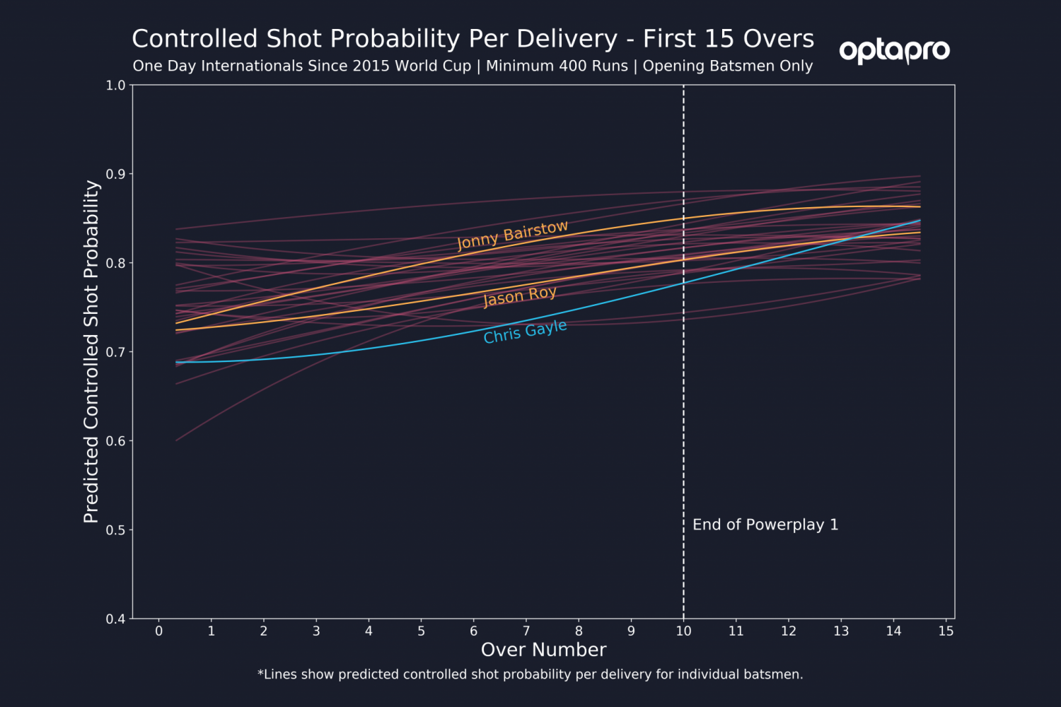
Now let us look at the controlled shot probability measure over the same batsman and innings period. Here we can see that Jonny Bairstow has a consistently higher controlled shot rate compared to Jason Roy. This control combined with high strike rates shows why Bairstow has been slightly more successful in this position (batting average of 50.41 runs per innings) compared to Jason Roy (batting average of 40.54 per innings). In comparison, Chris Gayle is more vulnerable during the first 10 overs. However, once we get 15 overs into the innings his control rate is above average, which combined with his highest run a ball rate shows why he can be so destructive if not dislodged early.

Jos Buttler
One of the most destructive players at this year’s World Cup is Jos Buttler. It does not require an expert to deduct this after taking a glance at his figures since the 2015 World Cup. He hits at a strike rate of around 175 in the final 10 overs of an innings; few others at this World Cup compare.
Let us dig deeper into these numbers. Are these final 10 over figures purely through consistent aggression? Or is Buttler able to switch gear like no-one else? Here we show our predicted runs per delivery rate across the final 10 overs for players with at least 400 runs in this period of the innings since the 2015 World Cup.

No one comes close to Buttler’s run per ball prediction at any point in the final 10 overs. What is interesting here is how Buttler’s curve is fairly linear. His acceleration has already started in the 41st over and is incredibly consistent, unlike many of the other players who wait until 44/45th overs.
Conclusion
The examples in this blog highlight how ball by ball data can be utilised to develop models for identifying various batsman archetypes, from aggressive risk-taking openers such as Chris Gayle, to consistent late innings aggressors such as Jos Buttler. By analysing performance on a finer scale we can extract more detailed information on player performance. For example, we showed how Jos Buttler’s sustained aggression rather than late innings charge contributes to his unmatched final 10 overs strike rate.
These methods can be used for understanding and visualising the performance of batsmen across all forms of cricket and is just the beginning of what is possible using Opta data for player performance analysis. Further opportunities include using our detailed event data such as shot types and bowling tendencies to supplement the run-rate and controlled shot information.
In our next blog we will take these methods further, by showing how clustering analysis of similar run rate and control rate progressions can be used to group similar players based on their innings compositions to identify player types. This enables our methods to be used for identifying similar players, which can be used for team composition and player scouting.
*Further Model Details:
As discussed in the article, to construct the data for which we fit our model, we utilise a moving window approach.
Let’s look at the last 10 overs of ODIs as an example. For the figures in this article, we used a window of size 2 on either side of the delivery of interest, where we are interested in deliveries 241-300. Hence, for each delivery between balls 241 and 300, we take the mean number of runs scored across a 5 delivery window (maximum of 2 either side + delivery of interest) within each innings. In many cases there will have been 0 deliveries faced in a window, hence there would be no data for that delivery in that specific innings. These data points are collected across each delivery in the segment for each innings a batsman has played.
Once we have these data points, we fit a Generalised Additive Model (GAM) across the innings segment. This takes a smooth function of all our run values across deliveries, where we use a penalised basis spline to control the smoothness of our curve to prevent overfitting. We can also construct confidence intervals since we are only averaging across 5 delivery windows within innings, not across innings. To prevent a common issue that splines have with erratic predictions on their edges, we include a 5 over buffer for data collection (if possible). For example, for overs 41-50 we fit the model to overs 36-50 but discard overs 36-40 in the prediction analysis. We also ignore predictions in the final window (deliveries 40.0-40.2 and 49.4-49.6 in this example) to reduce the impact of edge effects where we cannot include extra overs outside the segment of interest.